Areas – Change layout
You can always adjust the layout (division of the different elements per content area), the colours or whether a background image or not, etc. of the individual areas of your website.
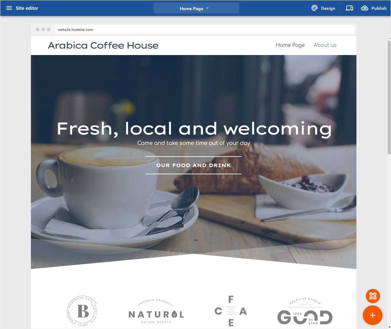
After you have logged in to the Designer you will find yourself in the Designer Editor on the start page and thus in the Site editor area. Proceed as follows:
1. Navigate
On each page, here on the start page of the construction kit, the pages are composed of different Elements (areas). These can be adapted at any time.
2. Area variants
There are different area or content types. Depending on the types, the editing options for title, text and image are different. We will discuss the following here:
• Title & Menu Bar
• Header area
• Content area images and text
• Content area with button and text
• Footer
• Customize text
• Customize image
• Customize button
3. Title & Menu Bar
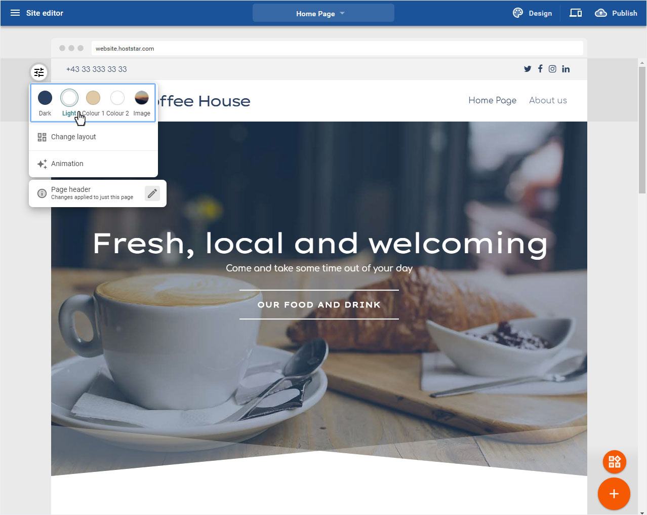
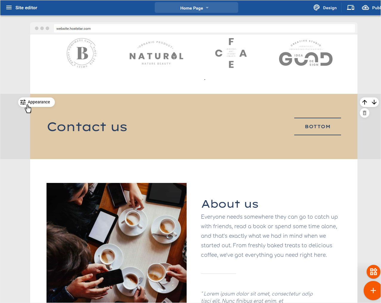
To adjust the Title & Menu Area, move the mouse over the round Slider icon to the left of the area, the Appearance button will open. Now click on the icon.

3.1 Edit area
The edit mode is automatically displayed. The following customization options are available here.
• Color selection or background image
• Layout
• Animation
• Header Adjustments
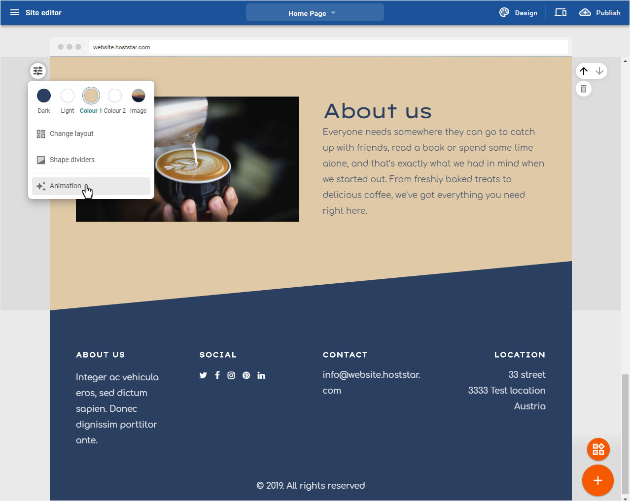
3.2 Color selection / background image
According to your chosen design and its color scheme, you can now define the area according to the 3 (or more) color components. Or you can select the image which will then be used as background image over this area.
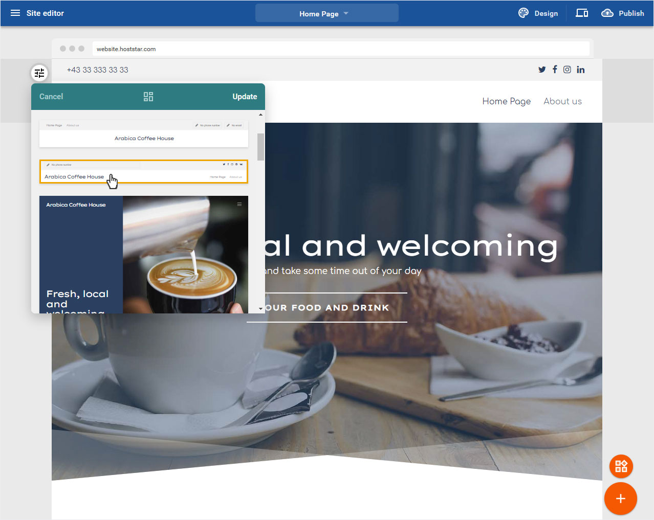
3.3 Change layout
To define which content is displayed in the header area, you can choose from various ready-made header areas. To do this, click on Change layout.

Select your desired header layout by clicking and then click on Update. The new layout will be applied immediately.
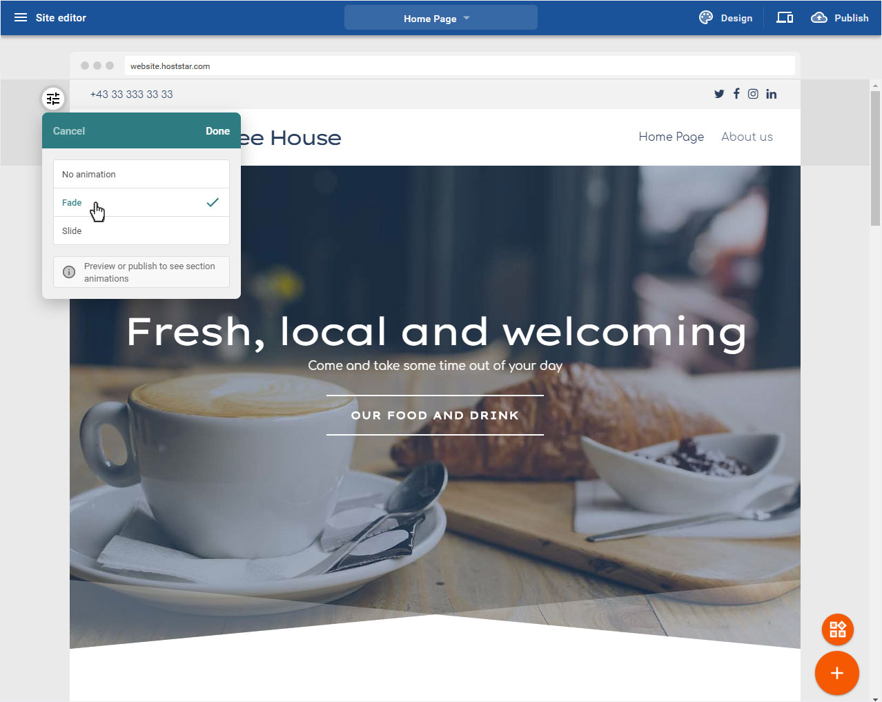
3.4 Animation
You can add an animation to the text areas and let them fade in accordingly. To do this, click on Animation.

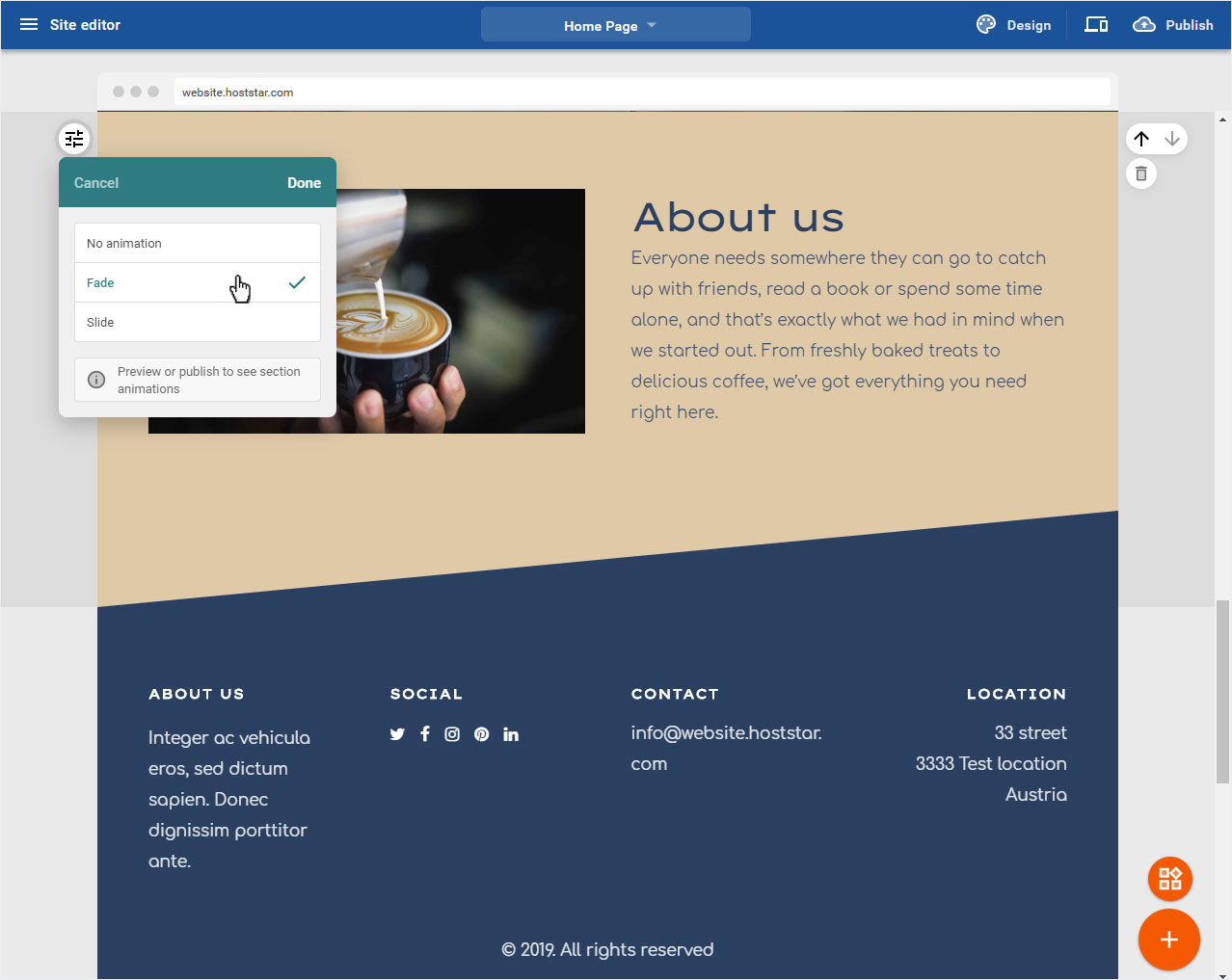
Now you can choose between Fade and Slide. Then click on Done.
Preview or publish to see section animations.
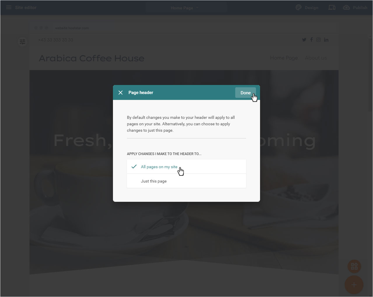
3.5 Header adjustment
You can define whether you want to apply the selected layout to the home page only or to all pages. To do this, click on the bottom section, here: Page header.

A popup opens with the options for your header area:
• All pages on my site
• Just this page
Then click on Done to save the desired changes.
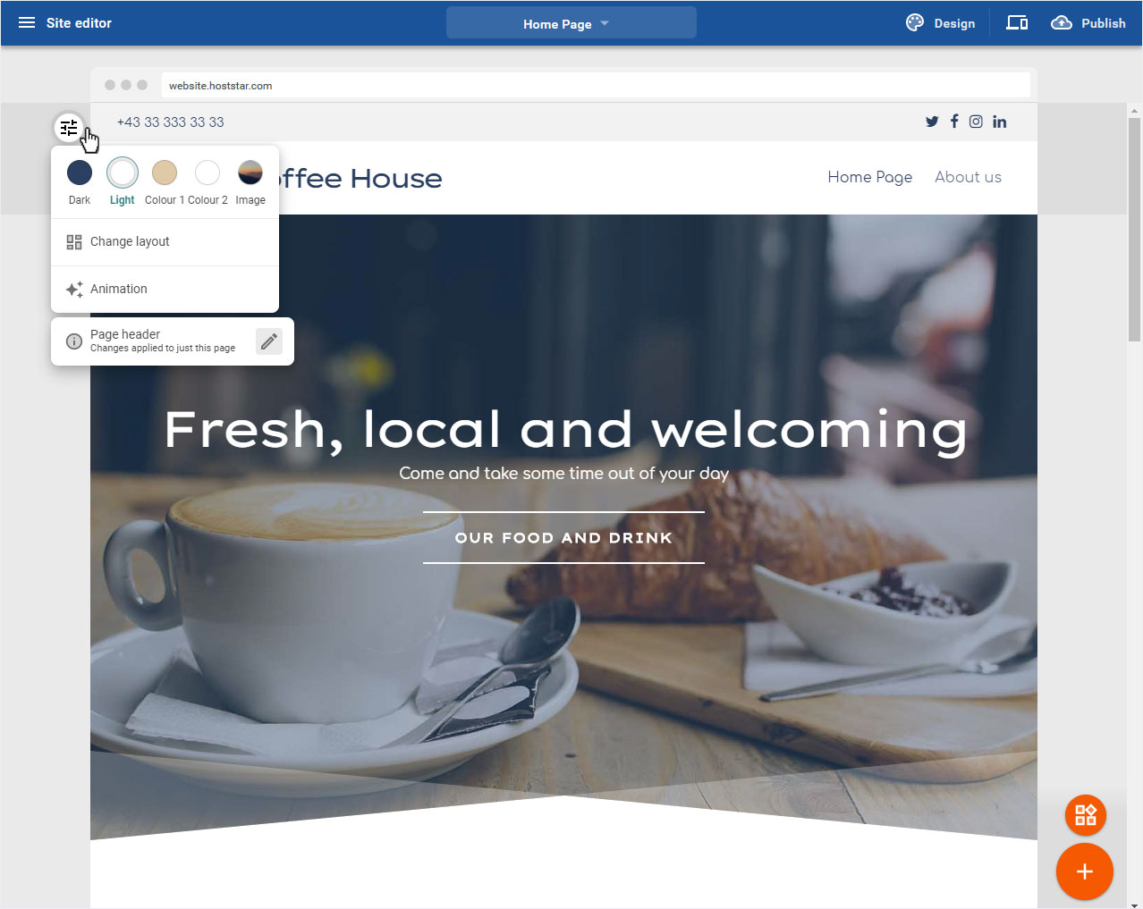
4. Header area
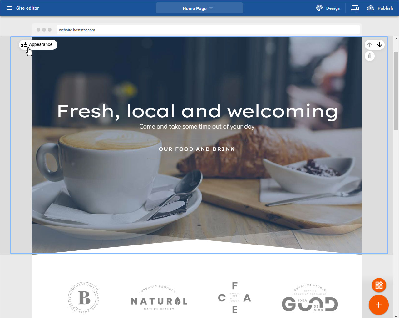
In the header area you can adjust the header image on the one hand and the header text on the other hand. Click on the appropriate area to continue.
4.1 Header image
If you want to adjust a full screen area, move the mouse over the round Slider icon on the left of the area, the button Appearance will open. Now click on the icon.
4.2 Header image - editing mode
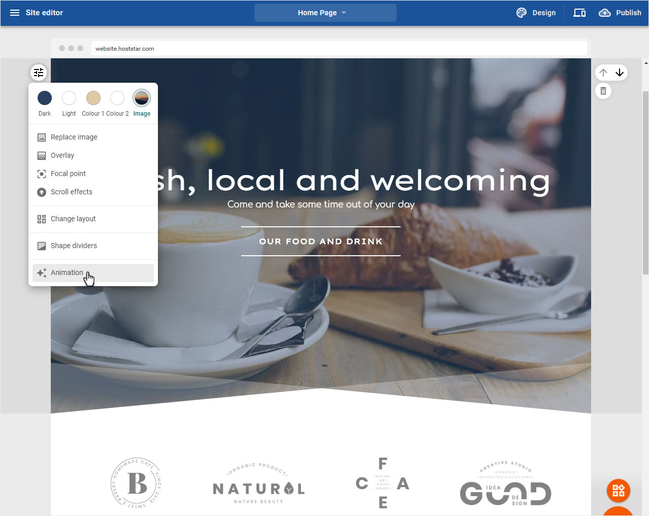
In this example, our startup image is a full screen area. The following settings are now available for adjusting the image:
• Replace image
• Overlay
• Focus point
• Scroll effects
• Chance layout
• Shape dividers
• Animation
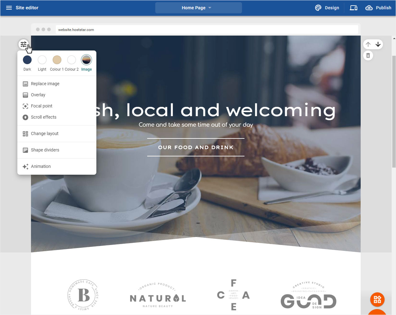
4.2.1 Replace image
You can exchange this picture at any time. To do this, click on Replace image.

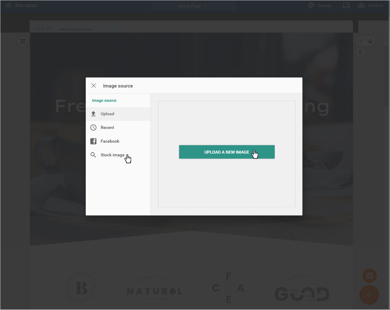
You can now either upload a new picture Upload or select a Recent added picture or one from your Facebook account or get a Stock image.
Please note that depending on your subscription, a certain number of photo credits are available to you for the designer.
When you have selected your picture, click on it. It is saved immediately and the view is updated.
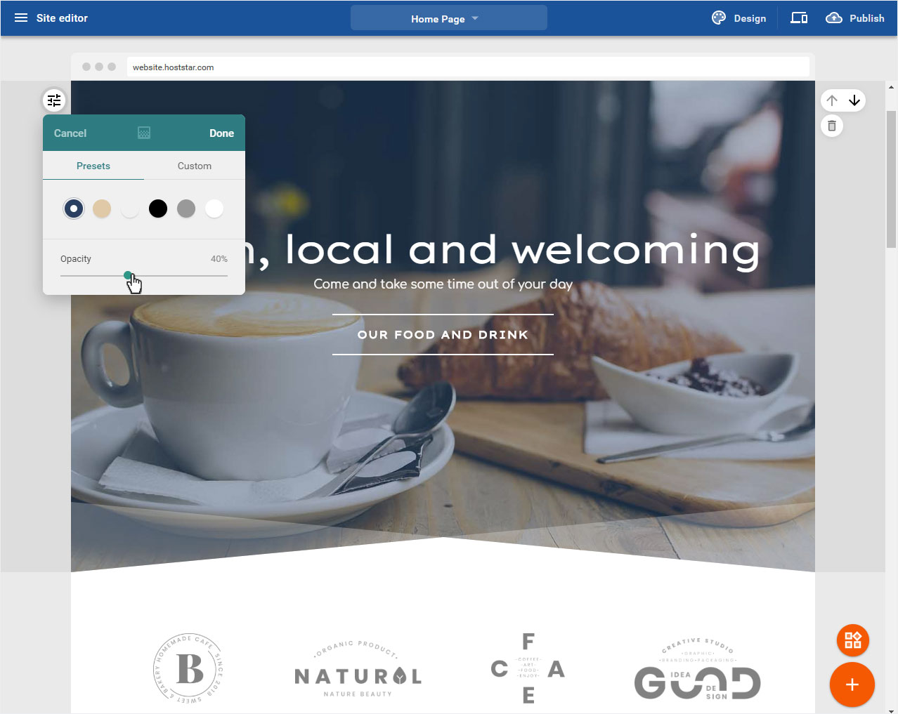
4.2.2 Overlay
The Full Screen area is displayed with a color overlay by default. If you want to adjust the Color or the Opacity of the color overlay, click on Overlay.

Depending on your chosen design and its color scheme, you can now select one of the dark or light accent color or the Overlay Color from black, gray or white in the Preferences section.
In the Individual ection you can insert your desired colour or the colour of your logo by hex or RGB data.

And now select the intensity with which the selected color overlays the image in the Opacity section. As you move the slider, the preview image adjusts immediately.
If you are satisfied with your settings, click on Save.
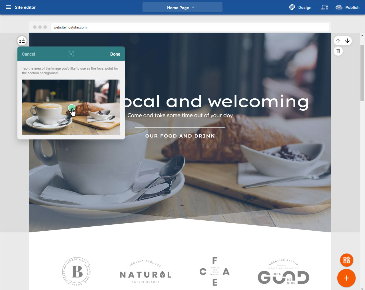
4.2.3 Focal point
In the Full Screen area you can set a focal point for this image. To do this, click on Focal point.

You can now set the focal point in the popup that opens by clicking the mouse in the image preview area. The preview image adjusts immediately.
If you are satisfied with your settings, click on Save.
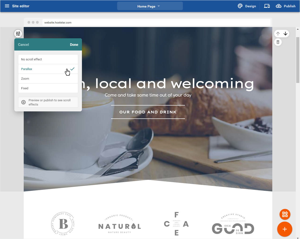
4.2.4 Scroll effects
If you want the header area to have a scroll effect, click the Scroll effects button.

Now you can choose between Parallax, Zoom and Fixed. Then click on Done.
To view the scroll effects, either click on Preview or publish your website directly.
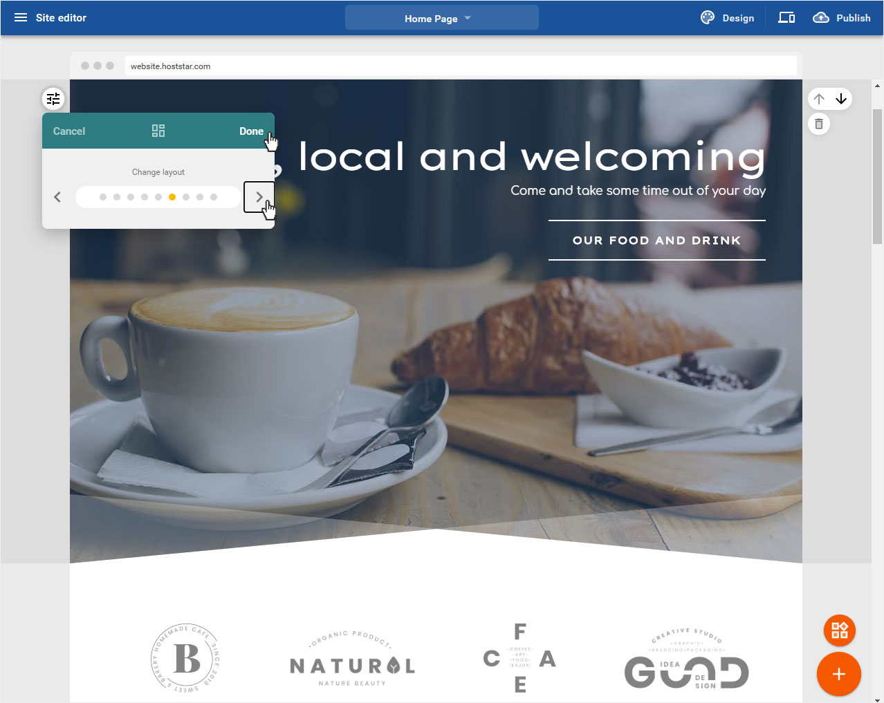
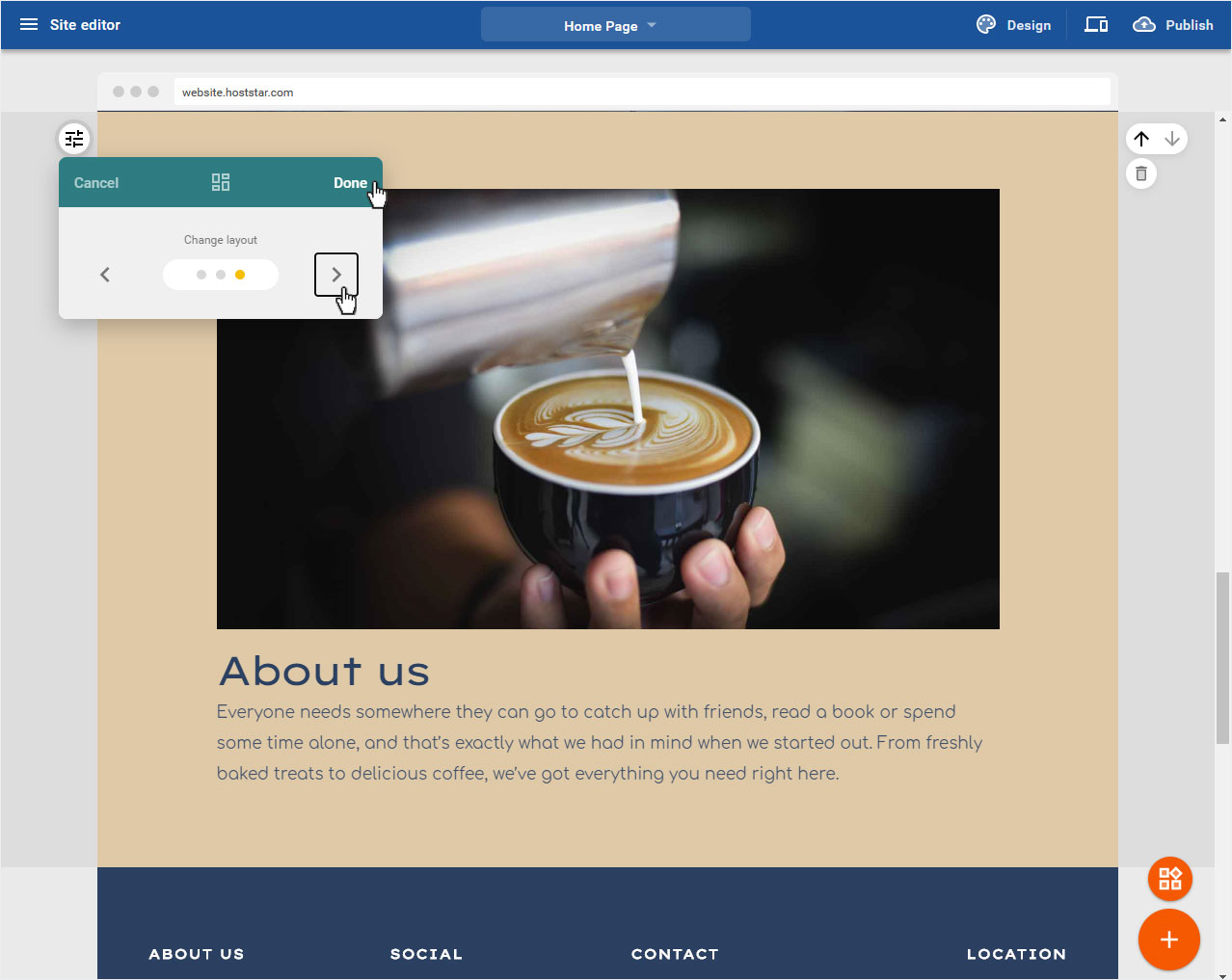
4.2.5 Layout
In the Full Screen area you can determine where or at which position in the image the Text Area is placed by selecting the Layout. To do this, click on Change layout.

Now click on the arrow icon to preview the different layouts.
If you are satisfied with your settings, click on Done.
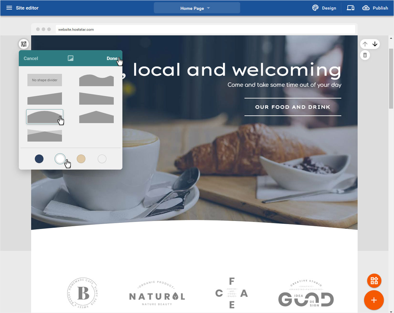
4.2.6 Shape dividers
If you would like to add a color accent to the image, select Shape dividers here.

Now select the desired shape of the dividing line. In the preview, the selection is immediately adjusted. You can now choose the colour of the dividing line according to your chosen design and its colour scheme.
If you are satisfied with your settings, click on Done.
4.2.7 Animation
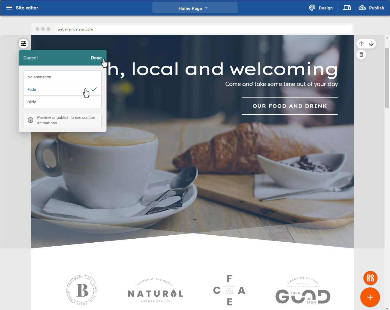
You can add an animation to the header image and have it displayed accordingly. To do this, click on Animation.
Now you can choose between Fade and Slide. Then click on Done.
To view the animation effects, either click on Preview or publish your website directly.
4.3 Header text
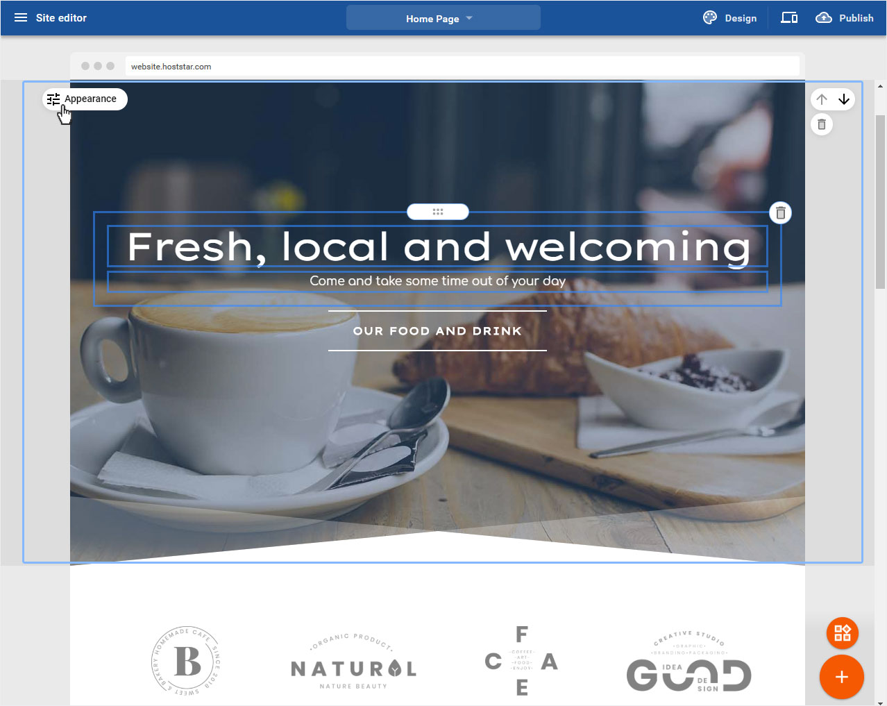
If you want to adjust a text in the full screen area, move the mouse over the desired text. This is now marked with a frame.
The following adjustment options are available:

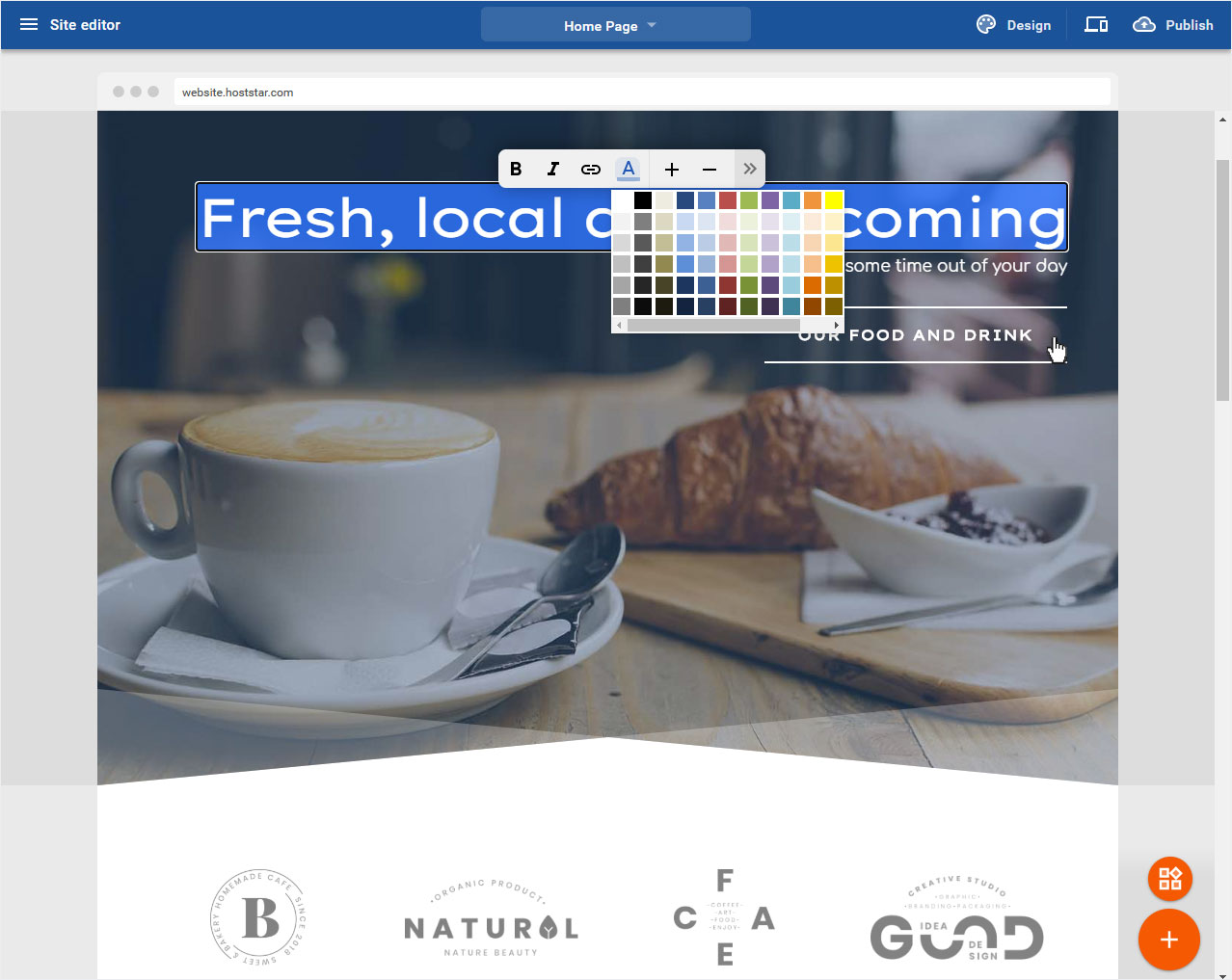
4.3.1 Customize header text
To change the Text area in the header image, click on the corresponding marked text.
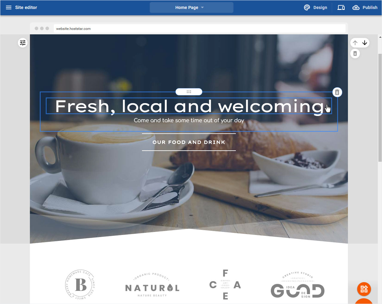
In the now opening edit mode you can adjust the text in the usual way (bold, italic, link, color, bigger, smaller) and by clicking on the arrow icon on the right, the alignment and list area opens.
If you are satisfied with your adjustments, click with the mouse outside the text and the text area is automatically updated and saved.
4.3.2 Delete header area
NOTE, if you click on the trash can icon next to the text, not only the text area is deleted, but the whole content module (here: header full screen including text area).
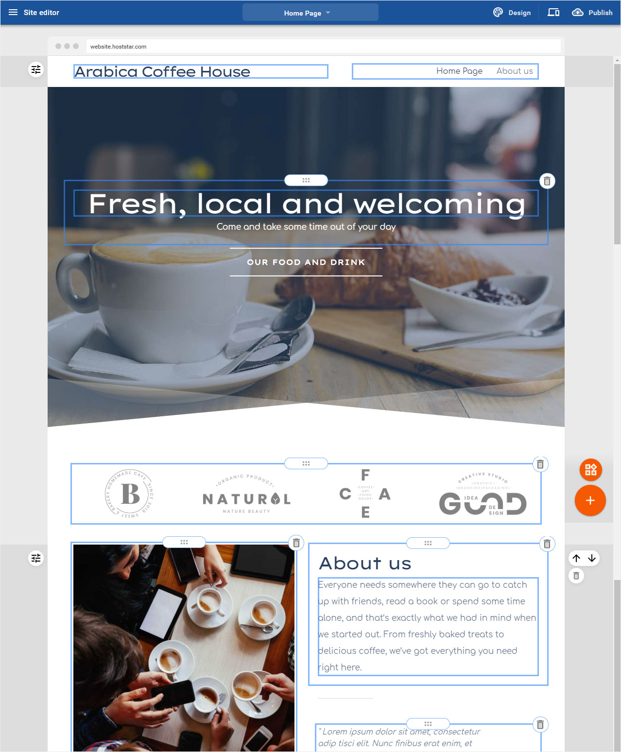
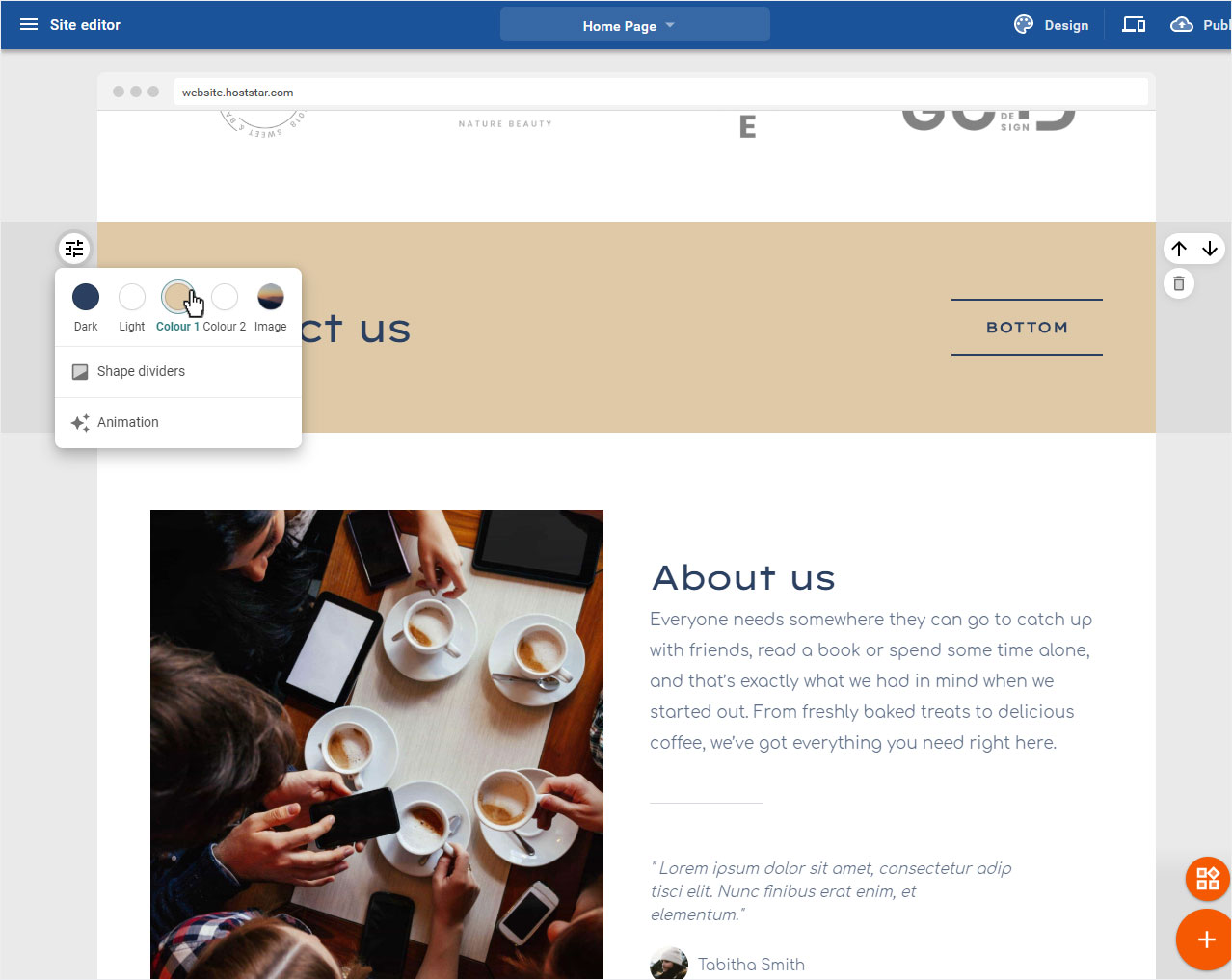
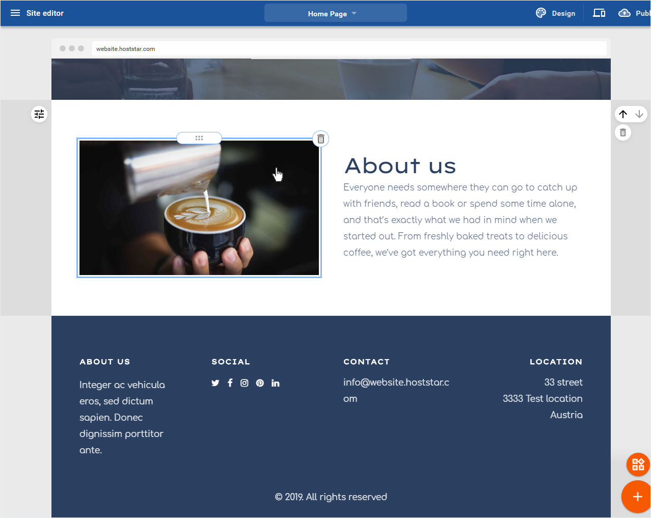
5. Content area with images and text
To adjust the Images & Text area, move the mouse over the round slider icon to the left of the area, the Bereich anpassen. Klicken Sie nun auf das Icon.
Of course you can also adjust the individual areas such as text and image.

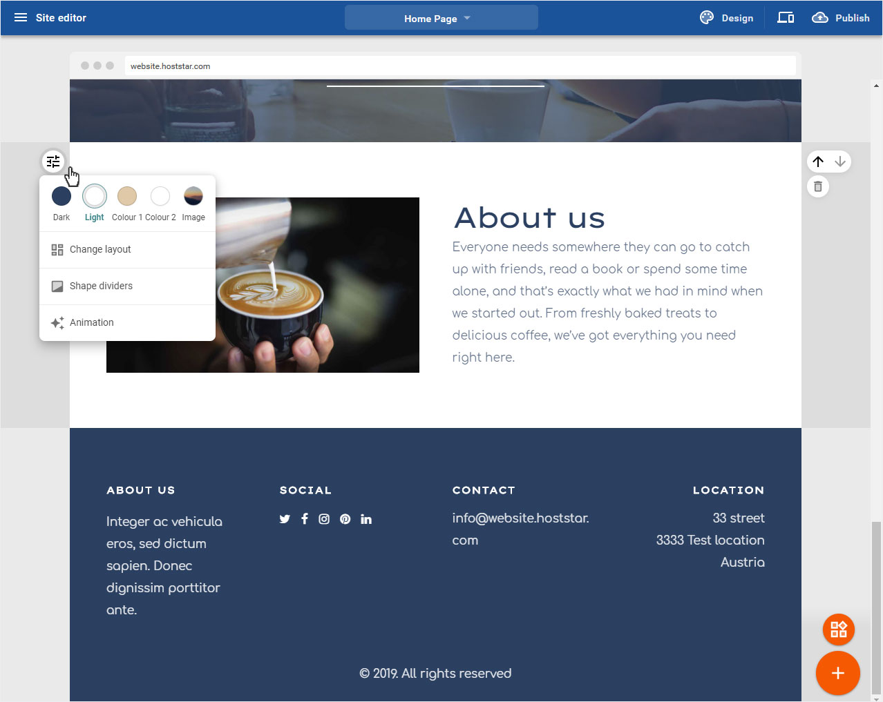
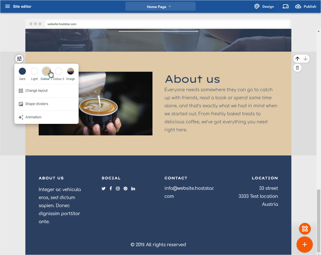
5.1 Color
To change the background color of the Image Text area, click on one of the colors available according to your chosen design and its color scheme. The preview will be adjusted immediately.
5.2 Layout
You use the layout to define where the image or text is placed (image left, right or top). To do this, click on Change layout.

In the popup that now opens, you can select the different layouts by clicking on the arrow icons. The preview is immediately displayed on the website. Once you have chosen your desired layout, click on Done to save your selection.
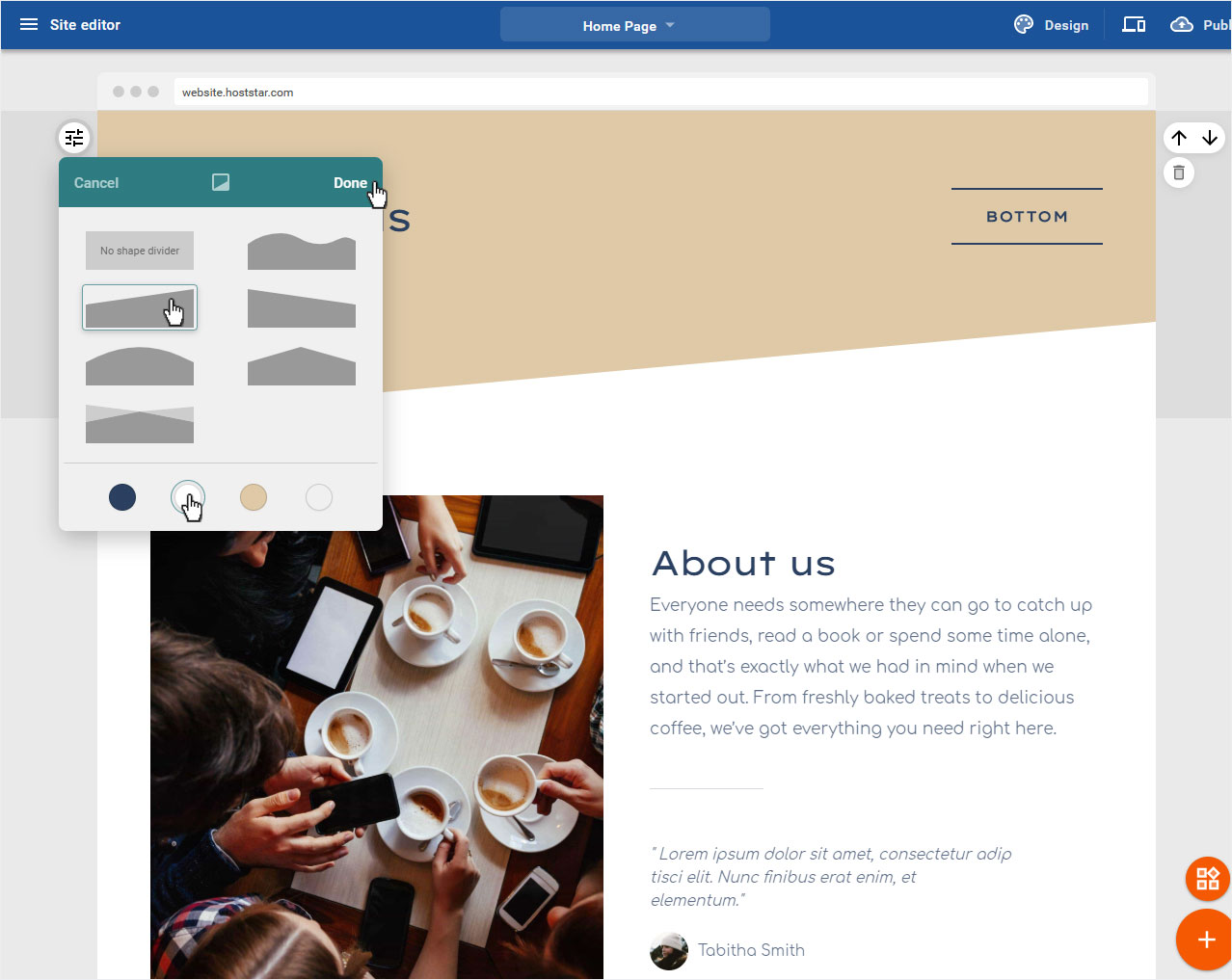
5.3 Shape dividers
If you would like to add a color accent to the image, select Shape dividers here.

Now select the desired shape of the dividing line. In the preview, the selection is immediately adjusted. You can now choose the colour of the dividing line according to your chosen design and its colour scheme.
If you are satisfied with your settings, click on Done.

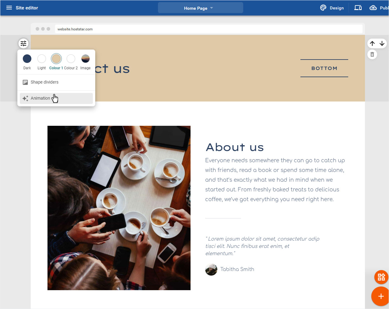
5.4 Animation
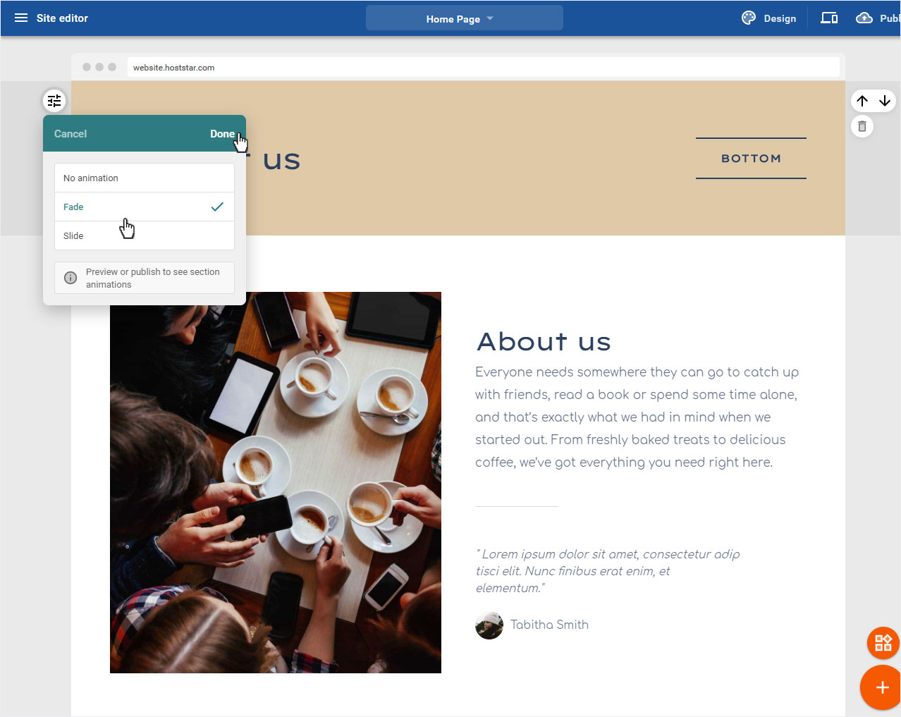
You can add an animation to the Image&Text area and have it displayed accordingly. To do this, click on Animation.
Now you can choose between Fade and Slide. Then click on Done.
To view the animation effects, either click on Preview or publish your website directly.
6. Content area with button and text
If you want to adjust a button text area, move the mouse over the round Slider icon on the left of the area, the button Appearance opens. Now click on the icon.
Of course you can also customize the individual areas such as text and button.

6.1 Color
To change the background color of the Button Text area, click on one of the colors available according to your chosen design and its color scheme. The preview will be adjusted immediately.
6.2 Shape dividers
If you would like to add a color accent, select Shape dividers here.

Now select the desired shape of the shape dividers. In the preview, the selection is immediately adjusted. You can now choose the colour of the shape dividers according to your chosen design and its color scheme.
If you are satisfied with your settings, click on Done.
6.3 Animation
You can add an animation to the Text&Button area and have it displayed accordingly. To do this, click on Animation.
Now you can choose between Fade and Slide. Then click on Done.
To view the animation effects, either click on Preview or publish your website directly.
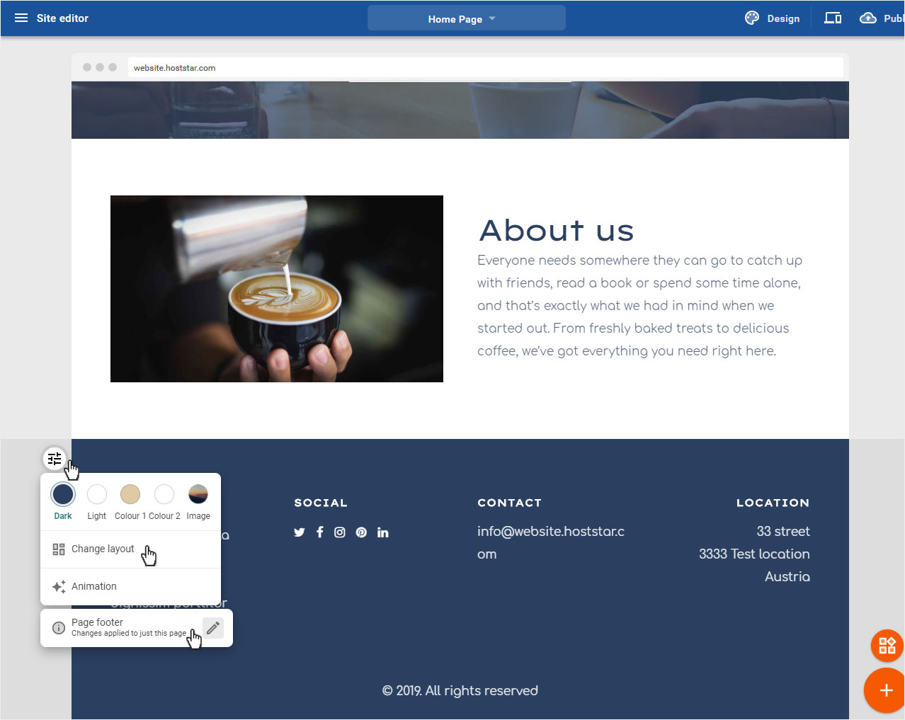
7. footer
The footer area corresponds in the customization of the Title & Menu Area.
Of course you can also customize the text areas.
To add an animation, follow the instructions in the title & menu bar.
Of course you can also choose for the footer, just like for the header, whether it applies to all pages or only to this page.
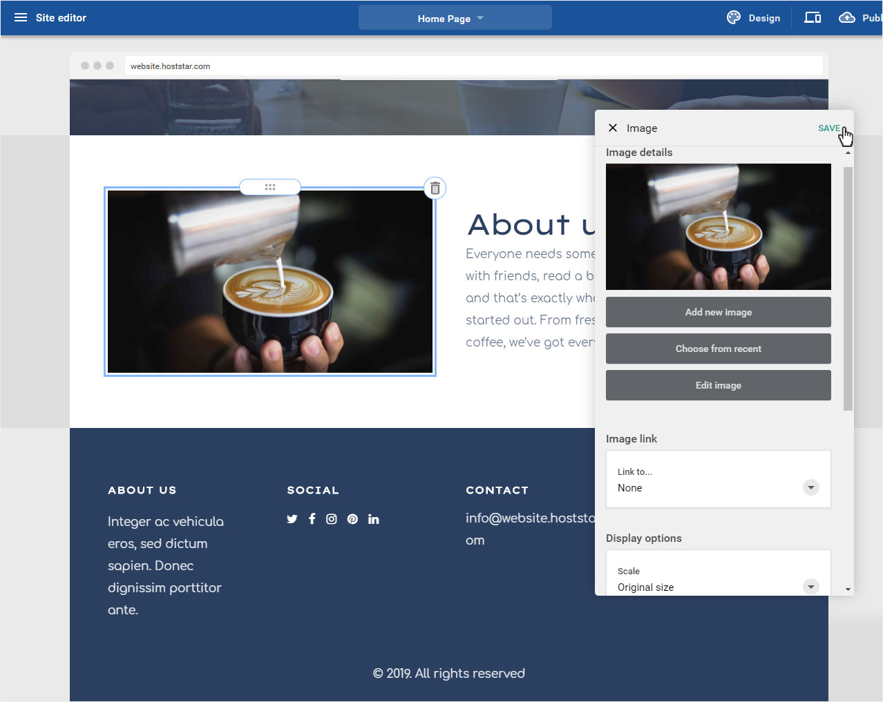
8. Customize image
To change an image, no matter in which area, move the mouse over the image until it gets a frame. Then click on it.
You can make the following adjustments in the popup that now opens:
1. Image details
You can Add new image, Select from existing images or Edit image.
2. Image link
Here you can assign a link to the selected Image. You can choose from A page on my website, An external page or An email address. Depending on what you select here, a corresponding area will open to enter the corresponding info (Select page / External link and target window / Email).
3. Display options
Select the Scale in which your image should be displayed (choose from various presets) and determine the Image alignment (left, center, right).
4. SEO
Store the SEO (search engine optimization) relevant data such as Alt attribute, Title tag and Description.
If you are satisfied with your adjustments, click on Save to save these changes.
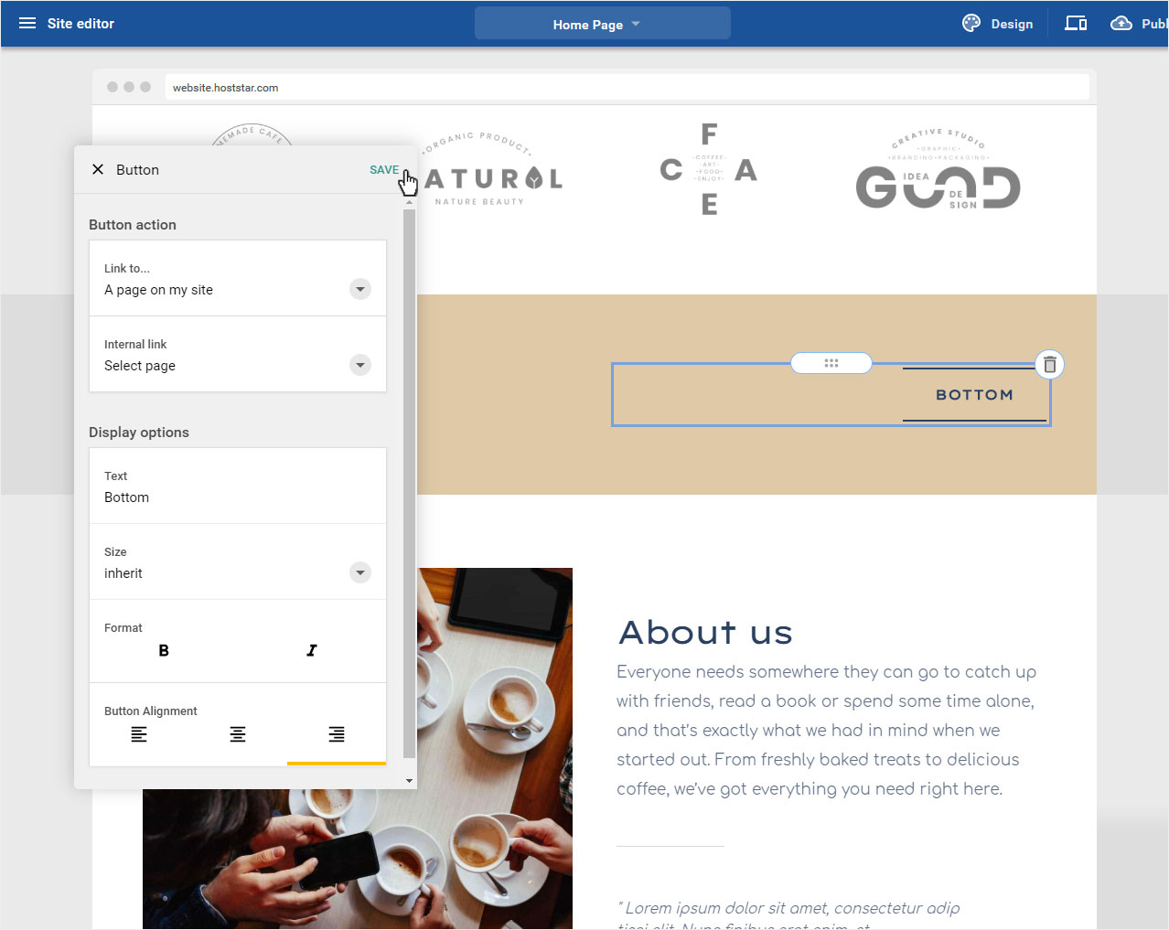
9. Customize button
To customize a button according to your needs, no matter what area, move the mouse over the button until it gets a frame. Then click on it.

You can make the following adjustments in the popup that now opens:
1. Click actions
Here you can assign a link to the selected Button. A page on my website, An external page or An email address. Depending on what you select here, a corresponding area will open to enter the corresponding info (Select page / External link and target window / Email).
2. Display options
Here you can add the text to be displayed to the selected Button under Text. Under Size you select the text size of the button text to be displayed. Under Format you can define if you want the text to be displayed in bold or italics and last but not least you can define the position of the button under Button alignment (left, center, right).
If you are satisfied with your adjustments, click on Save to save the changes.